Color in interior design is more than just choosing a paint for your walls. It’s the emotional backdrop of your life — the tones you wake up to, fall asleep with, host dinners in, work from home with, raise your children in.
The right color makes a space truly yours. The wrong one? It causes fatigue, irritation, and a desire to start over. In Vilnius, where much of the year is filled with soft, diffused light and winter can feel endless, choosing the right palette is especially important.
Here are three carefully thought-out tips that will help you create a color story that feels alive, balanced and long-lasting.
Learn what colors you feel good in.
Before you scroll through Pinterest or flip through interior magazines, ask yourself a few honest questions:
Where have you felt most comfortable? Think back to hotel rooms, friends’ homes, or past apartments — where did you feel most at peace, relaxed, inspired?
What colors are in your wardrobe? We often subconsciously choose “our” colors in clothing — and those same tones tend to feel natural in our homes.
Which colors do you avoid or dislike? That’s just as important. Even the trendiest hue can become unbearable if it doesn’t sit right with you emotionally.
Designer tip: Create a folder with interiors you love (on Pinterest or just on your phone), and look at the collection as a whole. What colors repeat? What moods do they share? That’s your starting point — your personal palette.
Don’t guess — test it
Color on a wall is always a surprise. The exact same shade can look completely different depending on:
What to do:
Don’t rush into painting your walls. If you’re drawn to a bold or unfamiliar color:
Ask yourself: Does this color feel comforting? Stimulating? Fatiguing? Would I want to see it every day — or only on Instagram?
This method is especially helpful when testing bold accent tones — you’ll quickly feel whether that “wow effect” is sustainable in daily life.
Understand color hierarchy: base, support, accent
Harmony isn’t about every color being beautiful on its own — it’s about how they work together. Each color should play a role:
Tip: Use the classic 60/30/10 rule
This creates visual balance and allows you to refresh your interior without major changes over time.
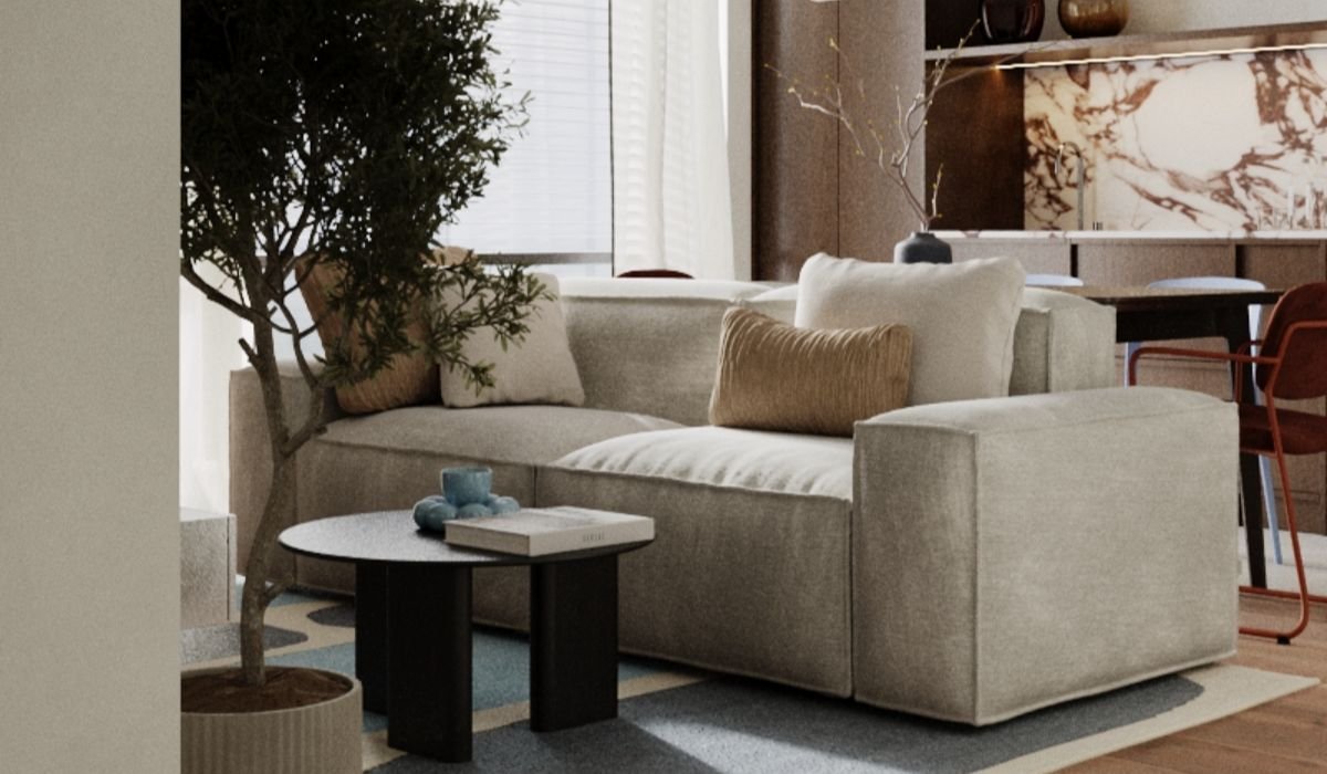
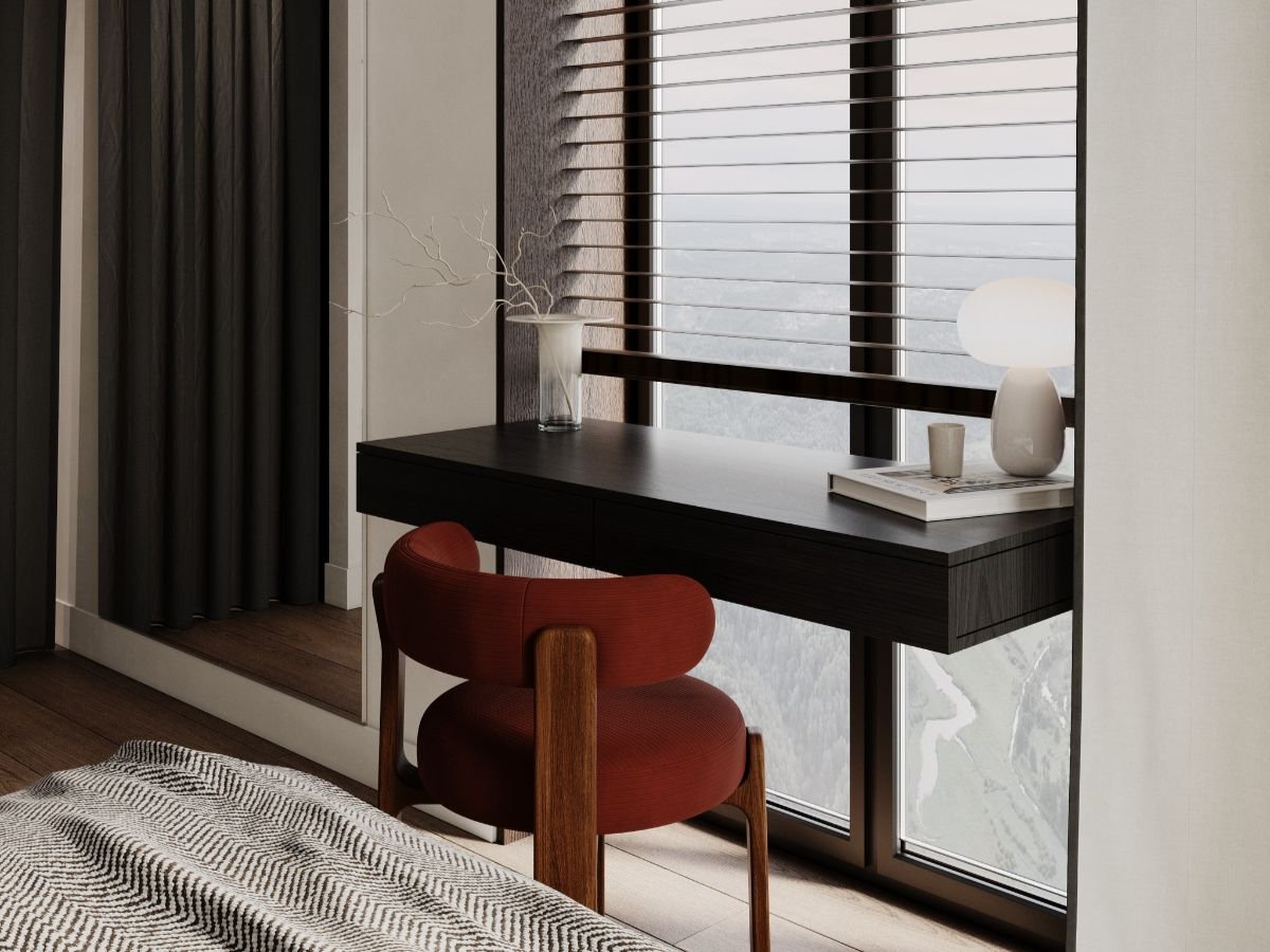
1. In our soft, greyish light and long winters, warm, muted tones (sand, beige, caramel, terracotta, olive) often work better than cold, clinical shades.
2. Pure white or cool grey can feel sterile or “clinical” under overcast skies. Opt instead for warm greys with a hint of beige or soft ochre.
3. Nature-inspired tones are always a safe choice — wood, clay, stone, warm greens, natural linen. These colors are timeless and inherently harmonious.
Don’t choose colors that just “look good in a magazine” — choose ones that feel right for you. Trust your body, your eyes, your emotions.
Live with the color before you invite it permanently into your home. Build your palette with intention — and it will reward you with a space that feels just right for years to come.
If you’re planning or starting a renovation and unsure which colors are truly “yours” — the team at Buro12 is here to help. We don’t just pick beautiful shades — we create the feeling of home.
Want to discover the colors that will work best for you and your space? Get in touch — we’ll craft a personal palette based on your lifestyle, habits and vision.
and we will get back to you.